New Roadmaps, Dark Theme Possibility Looming
Happy New Year of the Rabbit, xīnnián hǎo, 新年好!

The Spring Festival is coming up this weekend, starting on Sunday, January 22, celebrating the Chinese New Year and another Year of the Rabbit.
In the lunar calendar, 2023 is a Water Rabbit Year. The sign of the Rabbit is a symbol of longevity, peace, and prosperity in Chinese culture. 2023 is predicted to be a year of hope, especially after the long pandemic period. Wishing all of us lots of health, energy and happiness in the new year!
In this new year, the Revit development team has another topic to share with us:
- Dark theme possibility looming
- Dark theme switching
- Dark theme API
- Dark theme icons
- Code example: handling themed ribbon icons
- Dark theme additional notes
- Autodesk icon guidelines snapshot
- Autodesk AEC Public Roadmaps
Dark Theme Possibility Looming
We recently announced internal thoughts on possibly converting the internal representation of Revit element ids from 32 to 64 bit in a future release of Revit.
In a similar vein, here is another internal topic being pondered. Please note the important safe harbor statement concerning these thoughts:
Roadmaps are plans, not promises. We’re as excited as you to see new functionality make it into the products, but the development, releases, and timing of any features or functionality remains at our sole discretion. These updates should not be used to make purchasing decisions.
So, the possibility that I would like to present today concerns supporting the Dark Theme and how to handle it in a Revit add-in:
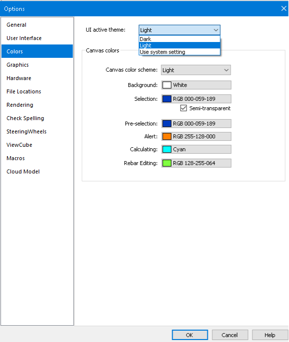
Dark Theme Switching
Setting the UI Active Theme will switch the appearance of the Ribbon between light grey and dark blue, with three options:
- Light
- Dark
- Use system setting – Windows supports light and dark colour schemes. If you choose this option, Revit will use the Windows colour scheme and switch to a matching theme accordingly.
Light:

Dark:

The UI Active Theme options can define other colour settings to override the default ones:

Dark Theme API
New properties and events may be added for dark theme support:
- ThemeChangedEventArgs – Arguments for the ThemeChanged event
- UIThemeManager.CurrentTheme – Allows you to set /get the overall theme for the Revit session
- UIThemeManager.FollowSystemColorTheme – Allows you to set /get if the overall theme follows operating system color theme
- UIThemeManager.CurrentCanvasTheme – Allows you to set/get a canvas theme for the current Revit session (as opposed to the default theme)
- ColorOption – Allows you to set/get the colours in the current canvas theme
Dark Theme Icons
Here are samples of the default dark theme ribbon background and button colour settings:
Light ribbon background:

Dark ribbon background:

Light ribbon buttons:

Dark ribbon buttons:

- Small button size: 16x16px
- Large button size: 32x32px
- Resolution: 96 DPI
- Icons
Code Example: Handling Themed Ribbon Icons
- internal class TestRibbon : IExternalApplication
- {
- private PushButton m_ribbonBtn;
- public Result OnStartup(UIControlledApplication application)
- {
- var ribbonPanel = application.CreateRibbonPanel("33900745-04F5-4CC2-9BAC-3230716E3A54", "Test");
- var buttonData = new PushButtonData("Test", "Test", typeof(CmdEntry).Assembly.Location, typeof(CmdEntry).FullName);
- buttonData.AvailabilityClassName = typeof(CmdEntry).FullName;
- m_ribbonBtn = ribbonPanel.AddItem(buttonData) as PushButton;
- updateImageByTheme();
- application.ThemeChanged += ThemeChanged;
- return Result.Succeeded;
- }
- private void setButtonImage(string pic, string largePic)
- {
- var assemblyLocation = typeof(TestRibbon).Assembly.Location;
- var assemblyDirectory = Path.GetDirectoryName(assemblyLocation);
- var imagePath = Path.Combine(assemblyDirectory, pic);
- var largeImagePath = Path.Combine(assemblyDirectory, largePic);
- if (File.Exists(imagePath))
- m_ribbonBtn.Image = new System.Windows.Media.Imaging.BitmapImage(new Uri(imagePath));
- if (File.Exists(largeImagePath))
- m_ribbonBtn.LargeImage = new System.Windows.Media.Imaging.BitmapImage(new Uri(largeImagePath));
- }
- private void updateImageByTheme()
- {
- UITheme theme = UIThemeManager.CurrentTheme;
- switch (theme)
- {
- case UITheme.Dark:
- setButtonImage("dark.png", "darkLarge.png");
- break;
- case UITheme.Light:
- setButtonImage("light.png", "lightLarge.png");
- break;
- }
- }
- private void ThemeChanged(object sender, Autodesk.Revit.UI.Events.ThemeChangedEventArgs e)
- {
- updateImageByTheme();
- }
- }
Dark Theme Additional Notes
Please note that only the 1st level UI supports the dark theme option.
Autodesk Icon Guidelines Snapshot
Prompted by Luiz' and Gábor's comments below, I acquired and posted an up-to-date snapshot of the current state of the Autodesk icon guidelines including the images above:
- Autodesk icon guidelines PDF
- Zip file including badges and PNG instructiuons
Thank you for asking, Luiz and Gábor.
Autodesk AEC Public Roadmaps
For more exciting news on possible upcoming product enhancements, check out the Autodesk AEC Public Roadmaps with dozens of items in each of the sections:
- Revit – Architecture
- Revit – Structures
- Revit – MEP
- Dynamo Public Roadmap