Roll Your Own Toggle Button
Today I took my first stab at creating, compiling and debugging a new Revit add-in on the Mac.
I cannot run Revit or Visual Studio natively on the Mac, of course, so those have to remain in Windows, hosted by the Parallels environment on the Mac.
I had to fiddle around quite a bit with the Parallels synchronisation, which seems to be breaking more things than it fixes, for me at least. I managed in the end in spite of that, though.
The opportunity to implement a new sample add-in was provided by the following question:
Question: Is there a way to create a ribbon button that can be toggled, e.g. a sort of on/off switch like the Modify > Properties button?
Answer: Yes, sure.
You will have to roll your own, though.
The Revit API just provides radio buttons.
Here is a description of radio buttons from Saikat Bhattacharya's upcoming Autodesk University class CP3272 Snapshot of the Autodesk Revit User Interface API:
Radio Buttons

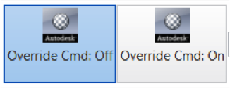
A radio button group helps toggle between options by letting users select only one ribbon item at a time. After adding a RadioButtonGroup to a panel, use the AddItem and AddItems methods to add radio buttons, which are basically normal PushButtons, to the group. The RadioButtonGroup.Current property can be used to access the currently selected button. Just like SplitButton, tooltips do not apply to radio button groups; instead the tooltip for each toggle button is displayed.
  RadioButtonGroupData radioData =
    new RadioButtonGroupData( "radioGroup" );

  RadioButtonGroup radioButtonGroup =
    panel.AddItem( radioData ) as RadioButtonGroup;

  ToggleButtonData tb1 = new ToggleButtonData(
    "OverrideCommand1",
    "Override Cmd: Off",
    assemblyPath + "\\" + assemblyName,
    "SnapshotRevitUI_CS.OverrideOff" );

  ToggleButtonData tb2 = new ToggleButtonData(
    "OverrideCommand2",
    "Override Cmd: On",
    assemblyPath + "\\" + assemblyName,
    "SnapshotRevitUI_CS.OverrideOn" );

  tb2.ToolTip = "Override the Wall Creation command";

  tb2.LargeImage = new BitmapImage(
    new Uri( imageFolder + "globe_32.png" ) );

  radioButtonGroup.AddItem( tb1 );
  radioButtonGroup.AddItem( tb2 );
However, this is still not quite what you want, is it?
You would really like one single button that changes its state each time it is clicked.
A Real Toggle Button
Well, as said, this can easily be achieved by implementing your own custom button.
Note that the RibbonButton Image, LargeImage and ItemText properties are all read-write.
Therefore, there is nothing to stop you from changing the button appearance any way you like at any time you like. For instance, if you change these properties appropriately each time the button is clicked, it will appear like a toggle button such as you describe.
I implemented a minimal sample illustrating this using just the ItemText property:
It would look more impressive if I switched the image as well, of course. I leave that as a simple exercise to the reader.
The basic framework to achieve this consists of a very small external application and a single-line external command.
The external application sets up the ribbon panel and button, saves a reference to the latter, and provides a public method Toggle that uses the button reference to toggle its text:
class App : IExternalApplication
{
  static string _path = typeof( App ).Assembly.Location;

  RibbonItem _button;

  /// <summary>
  /// Singleton external application class instance.
  /// </summary>
  internal static App _app = null;

  /// <summary>
  /// Provide access to singleton class instance.
  /// </summary>
  public static App Instance
  {
    get { return _app; }
  }

  public Result OnStartup(
    UIControlledApplication a )
  {
    _app = this;

    RibbonPanel panel = a.CreateRibbonPanel(
      "ToggleButton" );

    PushButtonData data = new PushButtonData(
      "Toggle", "On", _path,
      "ToggleButton.Command" );

    data.AvailabilityClassName
      = "ToggleButton.Availability";

    _button = panel.AddItem( data );

    return Result.Succeeded;
  }

  public Result OnShutdown( UIControlledApplication a )
  {
    return Result.Succeeded;
  }

  public void Toggle()
  {
    string s = _button.ItemText;

    _button.ItemText = s.Equals( "On" ) ? "Off" : "On";
  }
}
The button images could be toggled in a similar fashion.
The Toggle method is public, and used by the command to toggle the button state each time it is launched:
  public Result Execute(
    ExternalCommandData commandData,
    ref string message,
    ElementSet elements )
  {
    App.Instance.Toggle();

    return Result.Succeeded;
  }
Probably one of the simplest command implementations you have ever seen, isn't it?
This command was initially read-only, and that makes sense, but I had to change it to manual transaction mode for reasons explained below.
Zero Document State Support
I made the whole sample a little bit more complicated in order to enable its use in a zero document context as well as when a project is opened.
I implemented a trivial availability class that I use to set the button availability. In this case, I want it to be available always:
  public class Availability
    : IExternalCommandAvailability
  {
    public bool IsCommandAvailable(
      UIApplication a,
      CategorySet b )
    {
      return true;
    }
  }
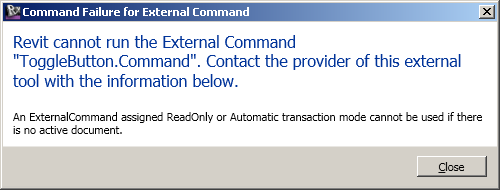
Enabling the command in zero document context also requires changing its transaction mode from read-only to manual, because Revit only allows manual transaction mode commands in zero document state. Violation of this rule causes the following error:

As you can see from the recording above, all is well now, and this is a viable solution.
Here is ToggleButton.zip containing the complete source code, Visual Studio solution and add-in manifest for this samplpe add-in.
While I've been having fun creating this sample, let's look at some examples of cool stuff other people are doing as well.
IDAT Revit Structure Slab Add-In
The German company IDAT presents a neat example of using the Revit API implement an add-in for the design, fabrication and construction logistics of precast hollow core slabs. This video shows their precast module for hollowcore slabs inside Revit Structure:Ab in den Hafen by Allerdings
Completely unrelated to Revit and its API, but closely related to me, my son Christopher aka Allerdings has been composing and publishing music on SoundCloud for some time now.
Here is his most recent oevre, Ab in den Hafen:
Enjoy.
AUGI Wish List
Another cool and important thing, albeit more administrative, is the AUGI wish list providing a unified independent voice back to Autodesk on how to improve its products.
Please vote now for your most important wish.